Branding
Logo/Colors/Fonts
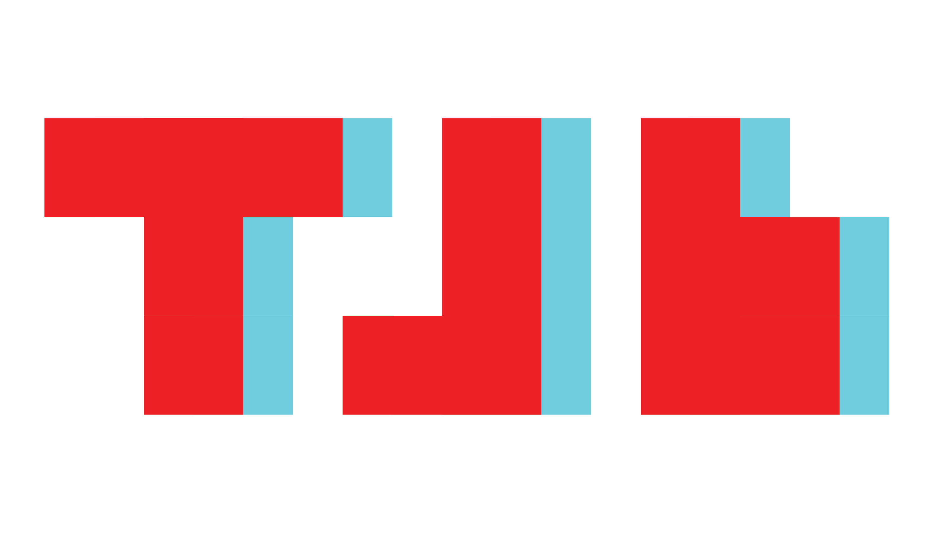
Like a lot of people, I have an appreciation of old stuff. Especially when it comes to technology. The shades of red (#ed2028) and cyan (#6eccda) I used where inspired by old 3D movie glasses.
Now for the logo, that was taken from my love of retro video games. Specifically, Tetris. One of the things I love about tetris is that even though each piece is just a series of blocks, people have given them names based on what shapes and letters they vaguely look like.
For the font I was going to end up using for my headlines, I wanted to use a font that was bold yet relatively condensed, and wouldn't take away too much attention from the logo. I ended up using League Gothic. On the other hand I wasn't as strict when it came to choosing the font I would use for my body text, all I knew I wanted was for it to be sans serif. But I came across Rajdhani and loved it. It's blocky like my logo and it kind of reminds me of some of the “techie” fonts that were used alot in the 90s and 2000s but less obnoxious.
Leave Behind
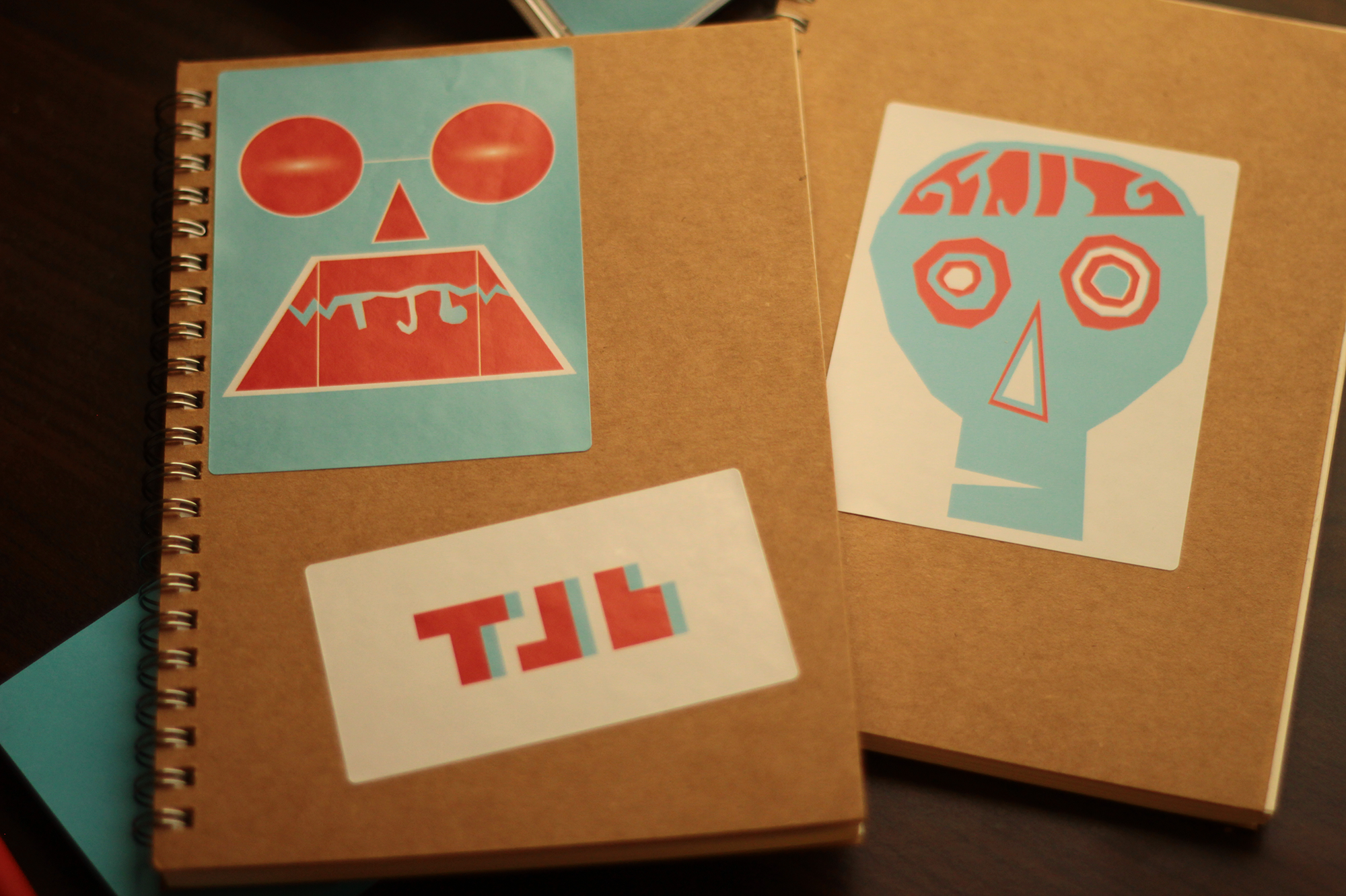
After looking at my logo for a while I began to feel that it has a "Punk Rock" attitude. So I thought what better way to stick it to the man then making it so you can stick my logo on things! So I made my leve behind piece stickers.
Following the suggestions of some of my peers, my initials were incorporated into the robot and zombie stickers, and the “wheel” bullet points on the packaging were replaced with square ones.
Business Card/Letterhead/Resume
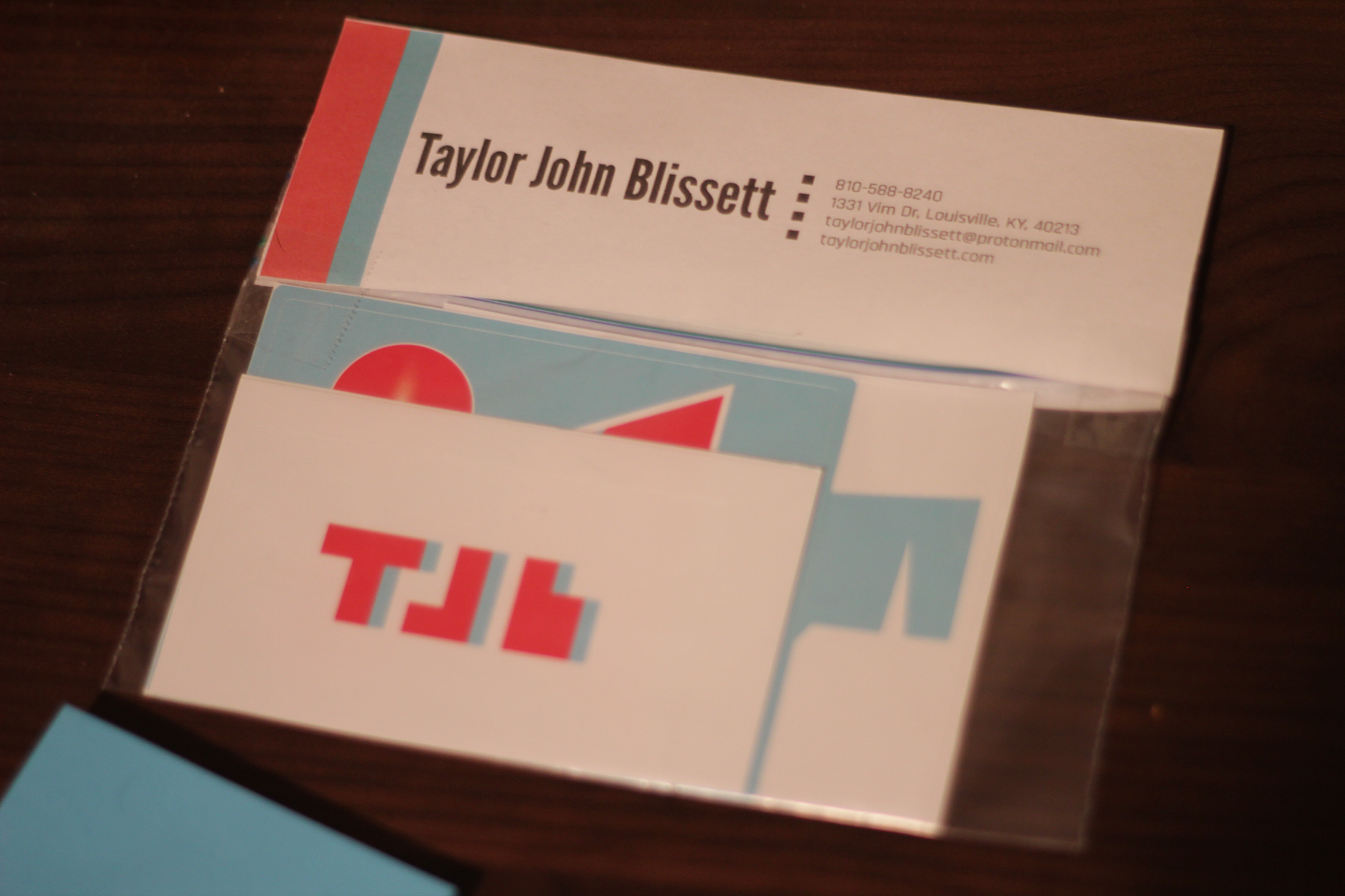
Just like the packaging for my stickers, my business card, letterhead, and resume all feature the same red and cyan stripes and the same fonts. Following the suggestion of one of my peers, the “wheel” bullet points were replaced with square ones.
Testimonials
I like your designs. They are very nice and colorful. They stand out with their respectful color schemes and the use of line and negative space is very well used in your paw and claws design envelope and letterhead.
Tyler Augbon
I believe those colors look very good together with brightening the red and blue. Overall, very great work!
Tatiana Harris on my logo
